I love renovating our 1948 Art Deco House. Not only is there the satisfaction of seeing our creative vision come to life, but it helps me become a better Colour Consultant. I say this because I’m now challenged with choosing the colour to paint our outside area. The major hurdle is not actually selecting the right colour but convincing my other half this is the correct choice.
Out of all of the customers, I have consulted this year, by far, Paul is the toughest client. If anyone knows Paul, you know that he is no marshmallow. If you are going to have a debate, you better bring your “A Game”. It also doesn’t help that he has done an apprenticeship in Painting and Wallpapering.
But the strangest thing happened when I went through our last colour decision; we agreed that there were only two colour options. I’m surmising that all my time on the shop floor and my continuous colour study over the years has rubbed off on Paul. Every chance I get, I tell him what undertone I see and which colours harmonise together. Whether Paul likes it or not, he is getting a free education – giggle :). Let me show how we arrived at our colour destination for the outside area without losing our minds!
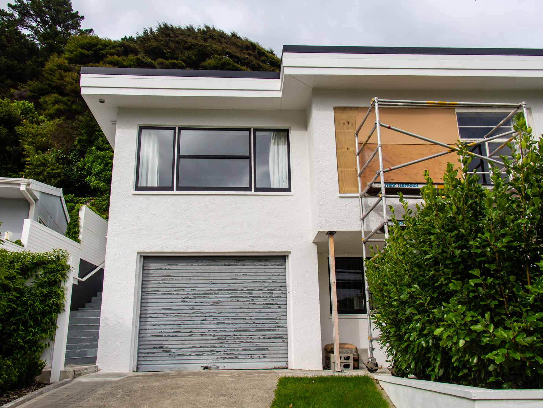
First off, we initially both liked the light blue-grey colour that is chipping off the stairs. However, I pointed out that the reason we like this is because the garage door is blue-grey, and it ties together. We will eventually replace the garage door with either an Alabaster white or cedar door, in which case the light blue-grey is not likely to look as cohesive.
Except when you see this colour next to our new laundry tile (which is our back door acting as our front door), a blue-grey will harmonise perfectly.
The blue-grey tester is in the middle.
The blue-grey also works with our back fence, painted in a deep custom charcoal with a blue undertone.
The first sample is the blue-grey.
We also have another bossy feature to acknowledge, our barbecue tile area. I bought these tiles on sale a couple of years ago and now realise that this tile is not a blue-grey but a violet-grey. This happens when you fail to compare and want to save a few bucks. In the long run, having a colour plan at the start saves you headaches in the future. Even a Colour Consultant needs a reminder sometimes! As you can see, the undertones are subtle, so this is why you always need to compare your neutrals.
With all these dilemmas and competing grey undertones, which grey neutral will we pick?
Blue-Grey – to work in with the back fence and the laundry tiles
Green-Grey – to flow on with the green-grey pavers from the driveway
Violet-Grey – which will tie in with the bbq tiles.
With the BBQ violet-grey tile, we are lucky that the tiles are around the corner. I think we can get away with it as the concrete steps break up the undertone.
In the end, we both agreed that we had to concentrate on what will give us the biggest impact from the street. A Green-Grey (the colour of concrete) will provide a nice flow up the side of the house and tie in with those beautiful herringbone pavers. Our second choice is blue-grey, which relates to the back fence and laundry tiles.
We are going to be using Bergers concrete paint from Dulux. They can tint the paint to colours from the NZ Dulux range as long as they come from a vivid white base. As with any paint choice, we will first test our two colour options. Take a look at my last post if you are up to the testing stage yourself.
I’ll be sure to reveal the outdoor colour when it’s complete. Knowing Paul, once we decide on the final colour, he will knock the painting out within a weekend. See you all next month!