Eventually the day will come when Paul has finished with the rebuild and he hands me the decorating baton. Since I want to be ready to run out our style in each room, I feel that there is still a few design elements that I still need to get my head around. My apologies in advance if I am using this blog post as my classroom, but I am hoping there might be some other home decorators out there who also struggle with the following topics:
1. How to choose your colour palette for your room and
2. Mix and matching your cushions for a designer look.
Over the last couple of weeks, I have been conducting some of my own research from design books, Pinterest and the telly. My aim is to summarise & share some of the best key points that I have learnt from my studies. Please do let me know if you have anything to add in the comments section below, after all collaboration is definitively the key to learning here.
Choosing your colour palette for your room
The 60/30/10 Rule

One of the best design books I came across on this subject, Big Design, Small Budget by Besty Helmuth. Betsy takes a different angle by suggesting choosing an inspirational piece to match the colour palette for the room. She then applies the popular, interior rule of 60/30/10.

In a nutshell, Betsy explains that your inspirational piece has to meet 3 criteria’s:
1. Do you love it
2. Can you see it from every corner of the room
3. Does it contain 3 or more colours.
Below Betsy has chosen the rug as her inspirational piece. The 3 colours in her rug are buttercream yellow, sky blue and chocolate. She is very particular about naming the exact colours because you are going to match these colour to the 60/30/10% formula.

So now we are going to take her inspirational piece (the rug) and the 60/30/10 formula and apply it to the room below. As you can see the walls in this room have been painted a buttercream yellow – which automatically gives you 60%. She is using sky blue as her 30% and this has been used in the throw blanket, accent cushions and with the painting above the sofa. The chocolate is dusted around the room with the brown and white embroidery pillows, the ottoman tray and also the colours in the painting.

What I love most about this formula is that you can keep the colour palette going into the secondary room by switching out the dominant colours. So perhaps in your dining room, sky blue could be your dominant colour at 60% and buttercream could be your secondary colour at 30%.
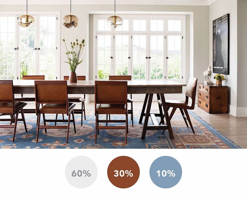
Just to drive the point home to myself, I thought I would see if I could find another example of this formula on my favorite web platform, Pinterest. Below the designer has chosen a rug which has 3 colours: mustard yellow, light smoke grey and dark concrete grey.

The walls have been painted in a light smoke grey which automatically gives you 60%. The occasional chair and the poof also add to this number. The mustard sofa and the throw add up to the 30%. For the 10%, the dark concrete grey is seen in the cushions and dabs of paint in the artwork.
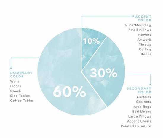
Perhaps like me you are not a mathematician and are wondering how do you give the room a percentage? Merakid design outlines it simply with this pie chart below. However, she does lump the sofa colour into the 60% so it did confuse me a little with the above example….
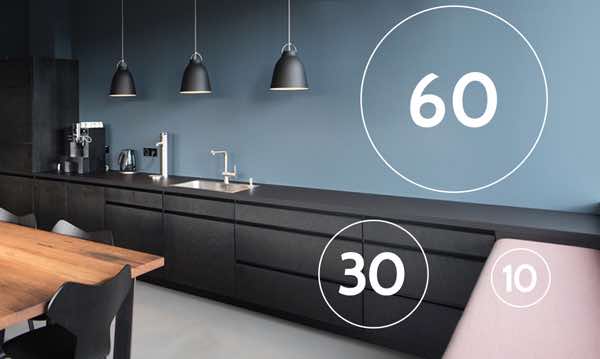
Another question came to my mind is what happens when you don’t have an inspirational piece on hand? Well you can also apply this simple design formula proportionally either with your furniture, paint colour, soft furnishings or art.

Moving on to my next 1st World problem – selecting sofa cushions that harmonise together. You might remember I had a little issue with amassing test pot paints in this post? Well, this affliction has also carried over to my cupboards full of mismatched cushions. I often sigh when I look at Interior design magazines and wonder how they always seem to pull the cushion display together so effortlessly. After finding the colour formula above, it got me thinking I bet stylists also have a strategy when furnishing a sofa?
Apparently they do…here is what I discovered on Pinterest.
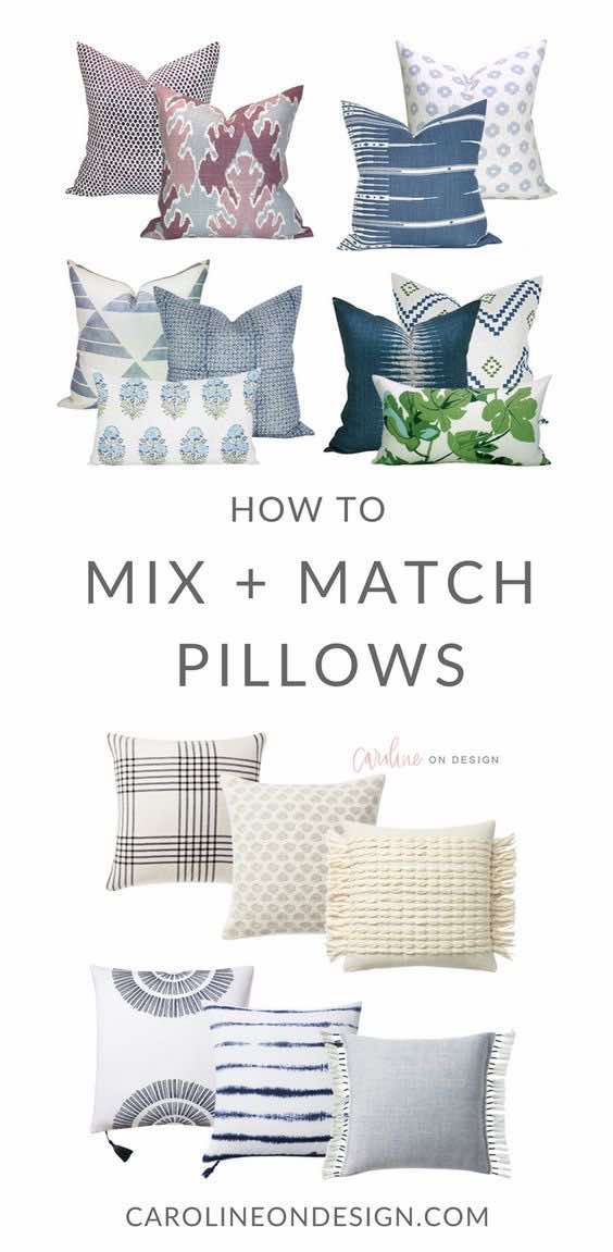
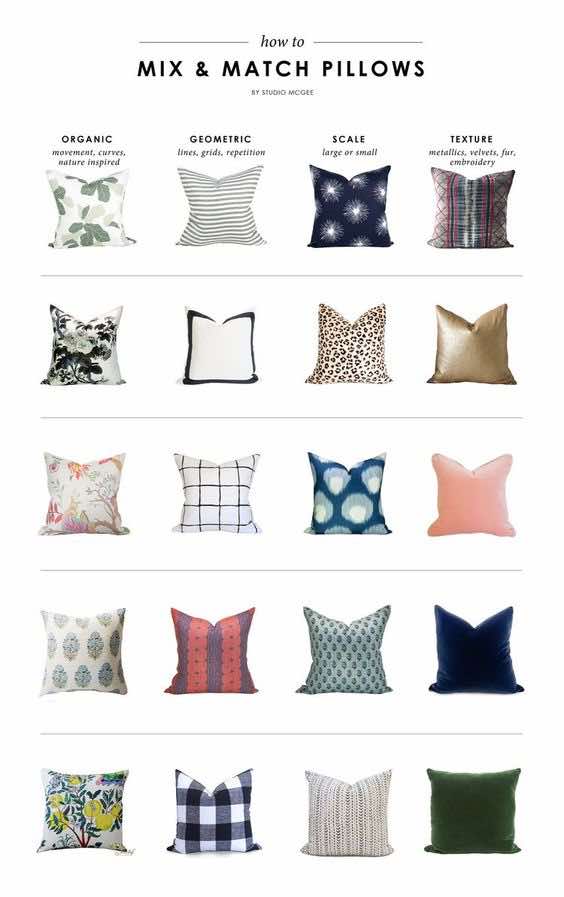
Caroline who is an Interior Design blogger mentioned she even struggles to get her pillows right (good to know). She follows this simple formula:
ORGANIC + GEOMETRIC + SCALE + TEXTURE
Organic =nature inspired
Geometric = lines or repetitive geometric pattern
Scale =large or small scale pattern
Texture = velvet, fur, or embroidery

See how Studio McGee uses the formula in this post:
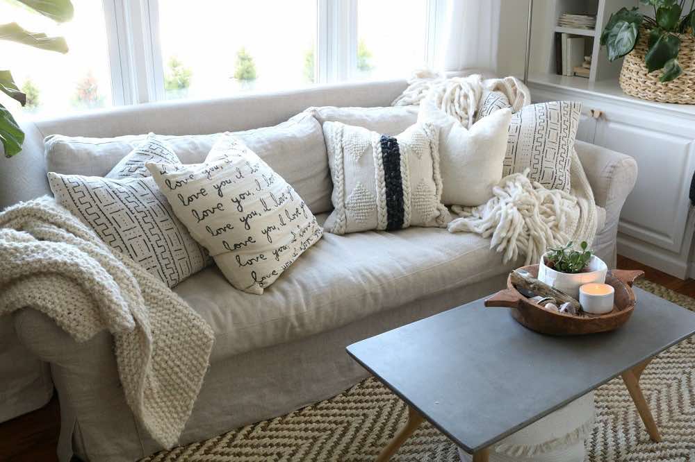
Another tip that I picked up for cushion styling came from Nesting with Grace. She recommends matching at least two cushions on your sofa like a bookend. These bookend cushions should also be the largest cushions on your sofa. What a cosy and inviting look she has created on her couch!
Hopefully the design concepts above are clearer than mud? Do let me know if you get stuck on any element as I can at least point you in the right direction/book/ or television show? Speaking of which my favourite t.v designer Joanna Gaines has finally launched her book, and mine is winging its way to New Zealand as I type. I pre-ordered this book in March so I am pretty excited to get my hands on it! If you haven’t checked out her magic yet, you can learn from one of the best there is here: Magnolia.com


6 comments
Val Sullivan
November 17, 2018 at 6:32 pm
Hi Cheree, I am sure you will make the right decisions when the time comes and you must put photos on Facebook when everything is finished xx
cheree
November 19, 2018 at 10:21 am
Thanks Val for your supportive input and yes I will be definitely plastering Facebook with after photos! x
Phyl
November 18, 2018 at 12:10 pm
A wonderfully informing article with some great ideas.
Well done on all the research
cheree
November 19, 2018 at 10:22 am
Thank you for those lovely comments and I am so glad you found the post useful.
Colleen
November 25, 2018 at 10:07 pm
Thanks for chunking down all that research Cheree
cheree
November 26, 2018 at 8:34 am
Thanks Colleen. Your feedback is gold!
Comments are closed.